Vint
A responsive web app for gym + fitness studio business management
About Vint
Vint started in 2014 as a peer-to-peer mobile iOS app connecting fitness instructors and clients, giving each party improved pricing rates by removing markups typically found at gym and fitness studios.
However, after realizing the various complexities involved in this peer-to-peer space, Vint pivoted in February of 2016 towards a SaaS product that helps gyms and fitness studios manage their businesses.
Challenge
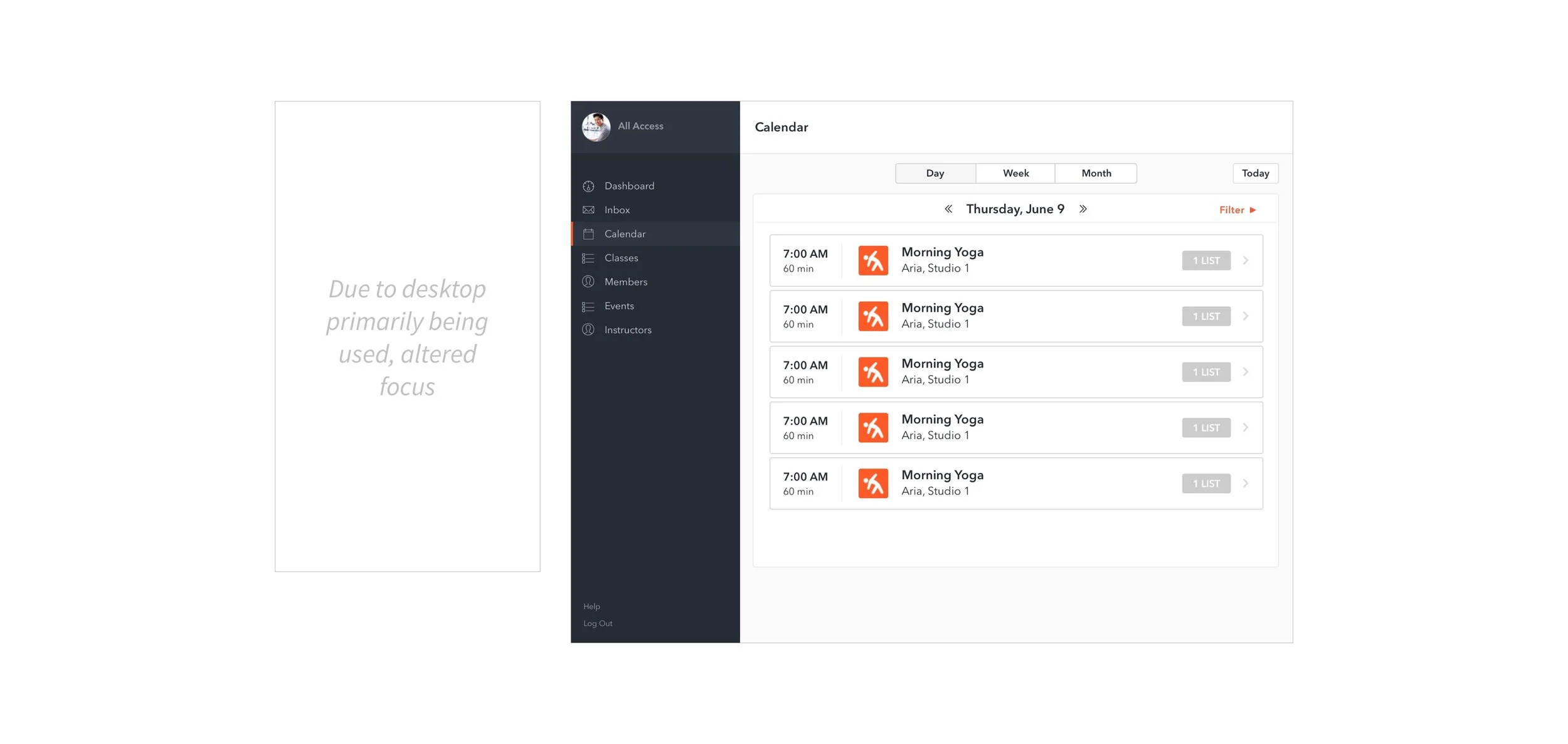
Pivoting into a SaaS product for gym and fitness studio management meant Vint needed to develop web responsive software that addressed its new users' needs -- calendar, class and member management.
Our challenge was to evaluate and include any relevant product features found in Vint's initial product, and ultimately create a new cohesive web responsive MVP that fit Vint's new user needs.
Role: Lead Product Designer
I co-led a team of 11 designers over a six week timeframe to deliver the MVP. Strategically, the team segmented into three micro teams consisting of Research, UX and UI teams. I played a leading role in all three teams and directed the Research and UI teams.
During the design process I led brainstorming workshops, user research, mid/hi-fi development and user testing. I also acted as a client point of contact and facilitated client meetings.
The 6-week timeline was tight and yet the team was able to deliver excellent and insightful results that exceeded our expectations. Kyle's proven talent to not only design, but lead, is something that will be of great value to any project he is involved with moving forward. I strongly recommend Kyle and know he'll be a core asset to any future product team.
The Cliff Notes
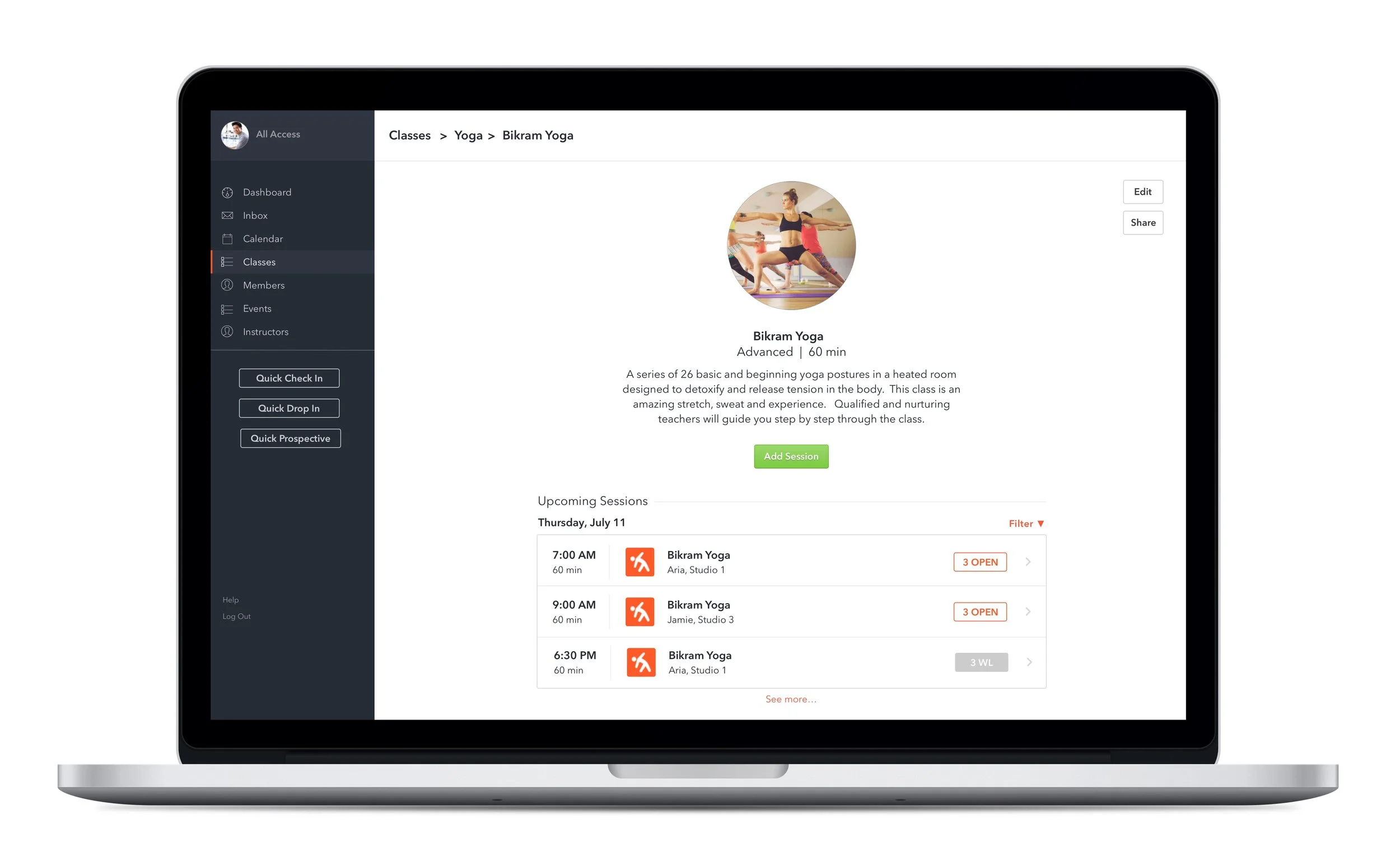
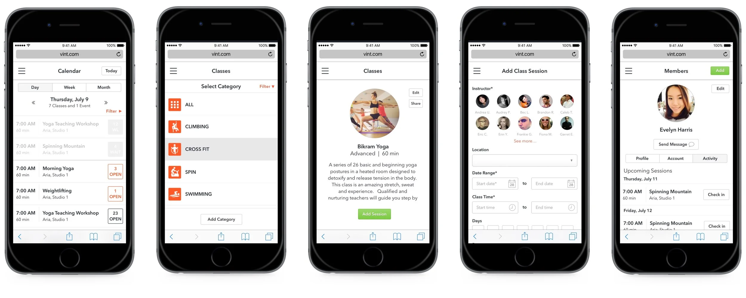
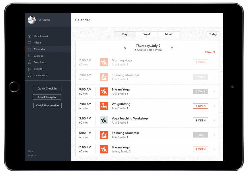
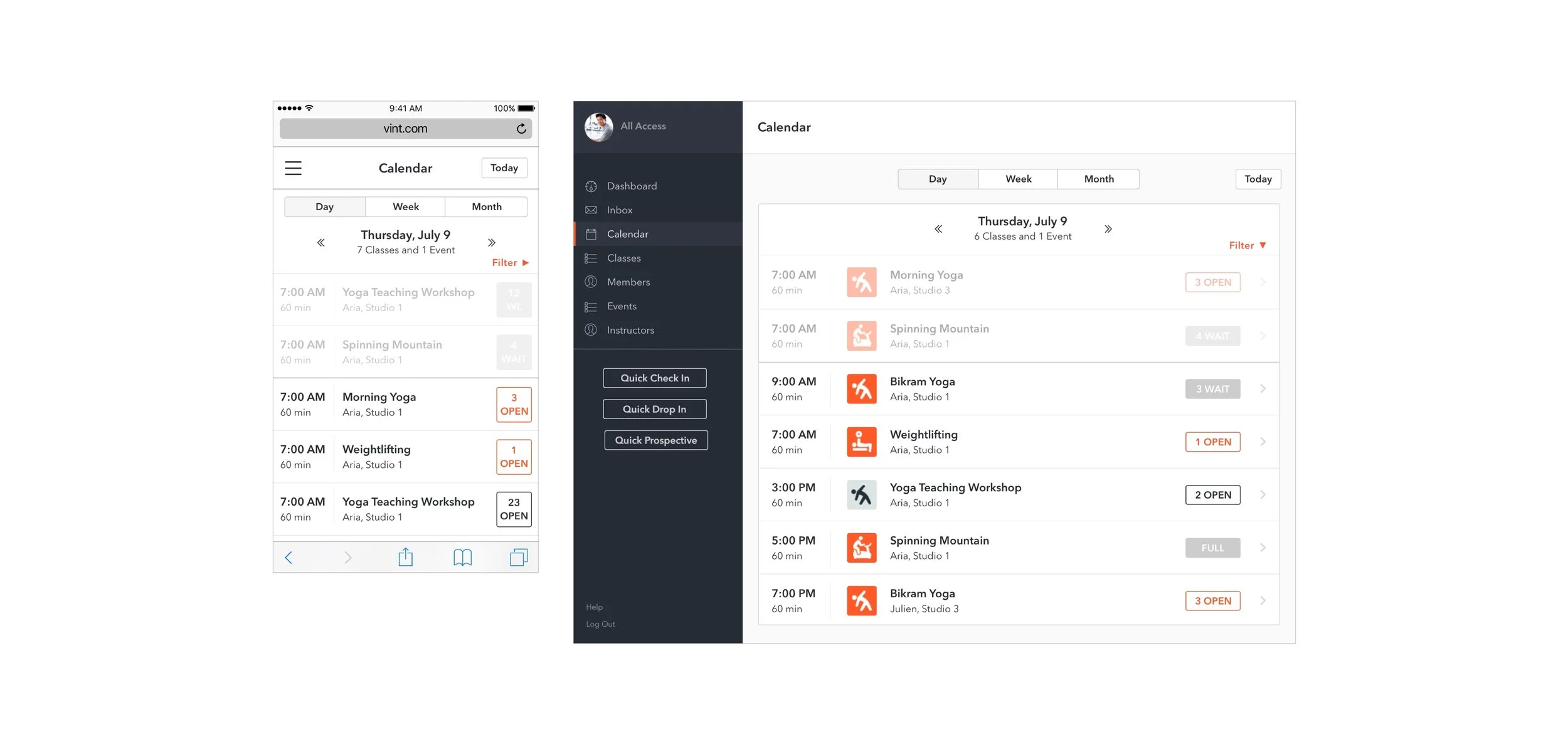
Check out the quick gif below illustrating Vint's main features (calendar, class and member management) or feel free to browse more extensively through the Marvel prototype.
Design Process Overview
We modified and expanded Google Venture's Design Sprint to structure our six week design process.
The design process was intense and we ran into some hiccups along the way but ultimately, we ended up with an MVP that users responded well to and enjoyed.
Design Process
PHASE 01 | Pre-Work
Define
After having a few conversations with Vint, we made educated assumptions about their new future users – for this MVP, users would need to manage their gym's or fitness studio's calendar, classes and members (this would later be validated through user research).
With this said, Vint's former peer-to-peer mobile iOS product contained a desktop admin panel that served as a starting point for our design challenge. We analyzed the former admin panel and after uncovering an overwhelming amount of confusion and inconsistency, we took note of the relevant features we could offshoot from.

Competitor Landscape
Now that we had a decent understanding of our design challenge and their former product, we embarked on researching competitors. How were competitors designing interfaces for calendar, class and member management? Below were 4 of the main competitors we looked at:
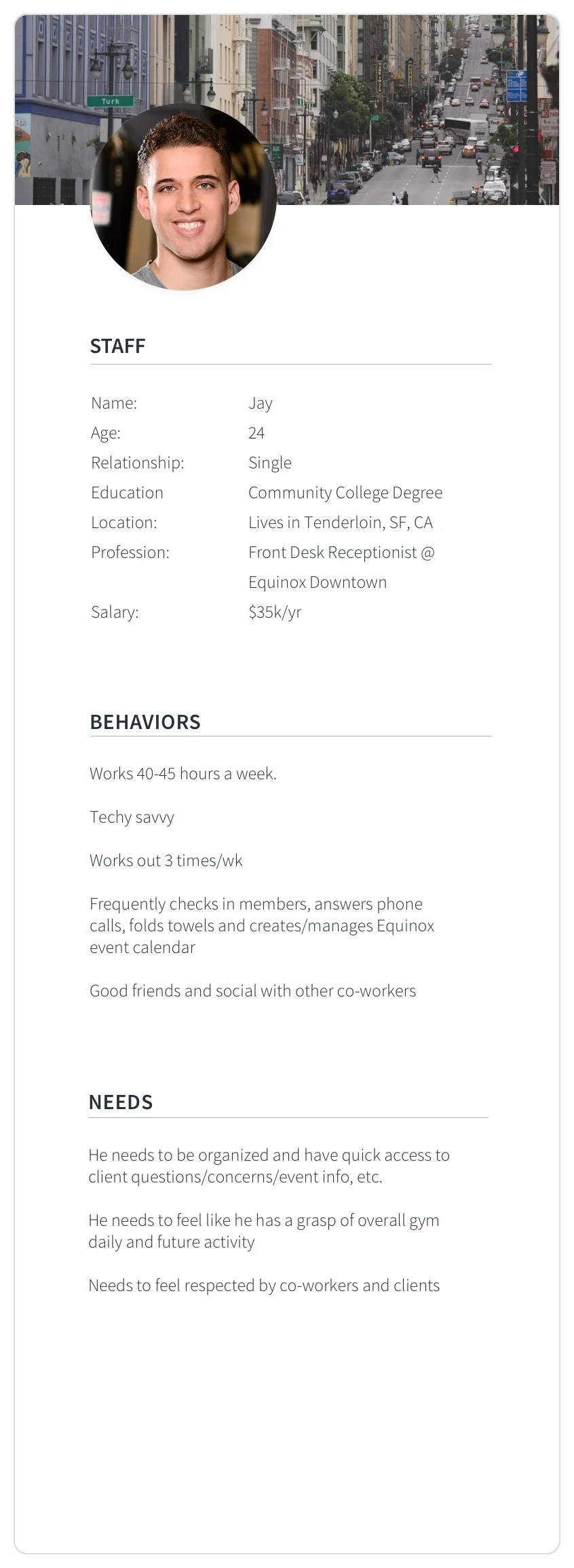
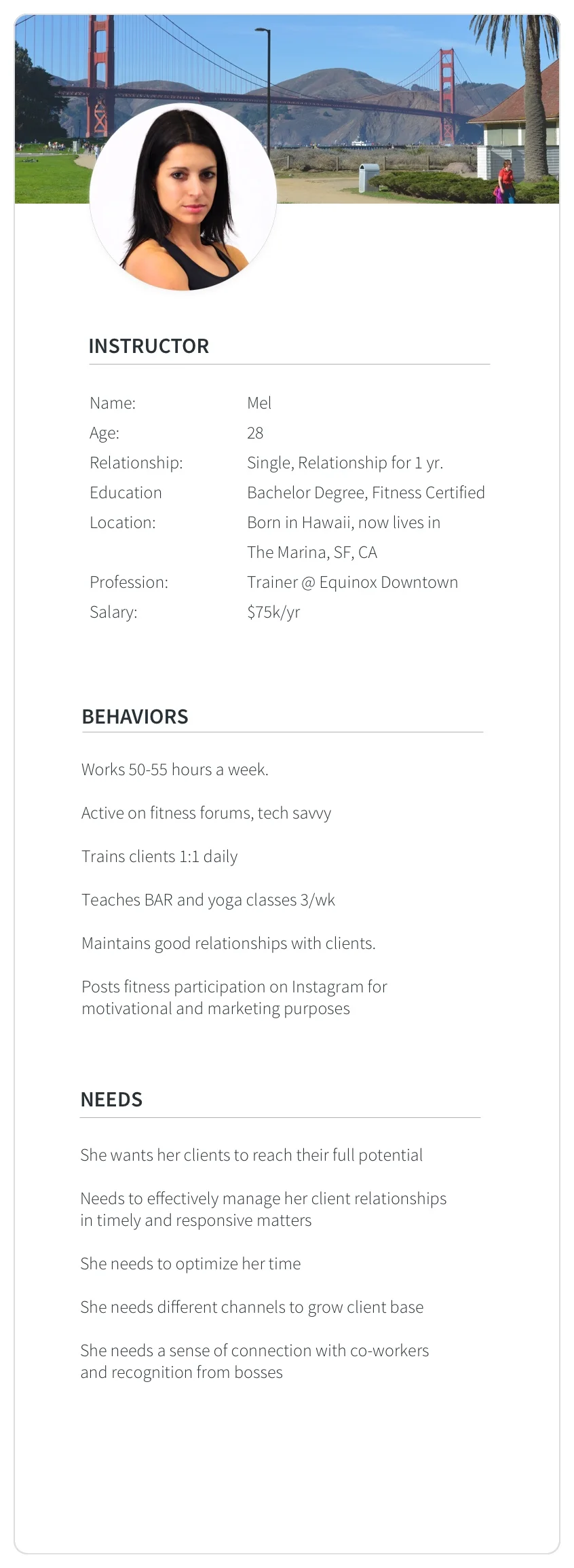
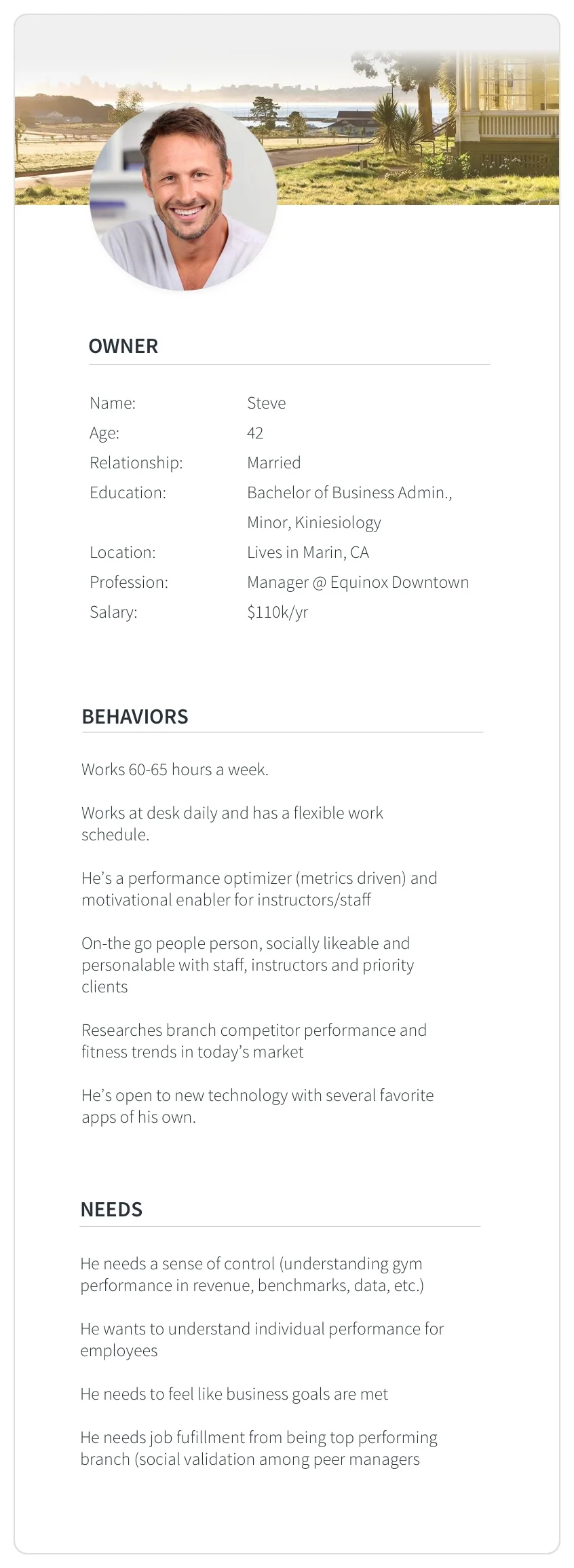
Provisional User Personas
In this early design stage, we created three provisional personas to help guide our design decisions. These personas helped establish users and were used in multiple workshops involving job stories and data modeling.
Job Stories + Data Modeling
Using our provisional personas, I led several rounds of workshops involving job stories and data modeling. This helped us begin to discuss information architecture as well as establish a baseline for categories of data needed in the app.

PHASE 02 | Research
Generative User Research
In order to get a better understanding of Vint's potential users, I led the Research Team in conducting 7 user interviews through a series of generative and usability styled questions. As a team, our two primary goals were to:
Identify user pain points in regards to current systems used for calendar, class and member management
Understand employee structure and role responsibility in relationship to calendar, class and member management

Following these interviews, we gathered as a team, made observations and through affinity mapping, determined patterns and themes related to our initial research goals. As a result, we ended up with some key takeaways.


Takeaway 01
7/7 Users felt that their existing system slowed them down in real-time customer facing tasks, which ideally need to be optimized for time & accuracy.
Takeaway 02
6/7 Users felt overwhelmed by their current platform for calendar, class and member management and preferred something that was more user friendly and visually coherent
Takeaway 03
3/7 Users felt that they need variable access rights for their employees
Takeaway 04
4/7 Users found immense value in mobile access to all platform features
PHASE 03 | UX + Wireframe Development
Crazy 8s
Based on design process thus far, we gathered as a team and did rapid rounds of Google Ventures' design exercise crazy 8's. After each round, we explained our ideas and voted using dots in what features we liked as a group.
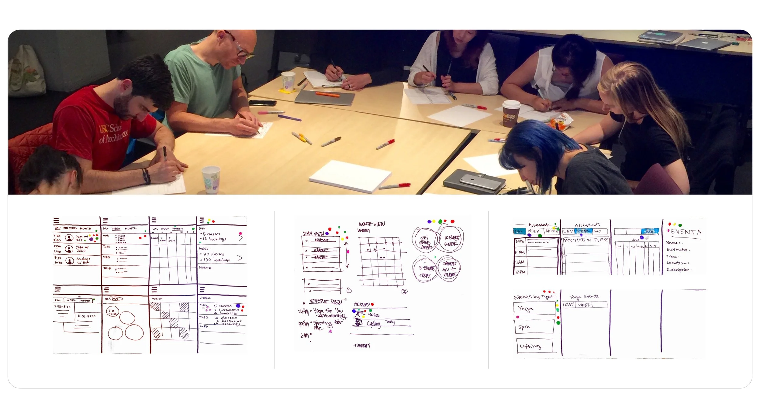
Iterative Wireframe Design
Form here, the UX Team launched into lo-fi development while the UI Team, which I led, got ready for hi-fi development by developing a working style guide. Although I wasn't involved in the initial lo-fis, after seeing team inconsistencies I took on the role developing mid-fi and hi-fi wireframes. Some of my largest iterative development involved the Calendar and Members pages. Below is one iterative example of the Calendar development:
v1
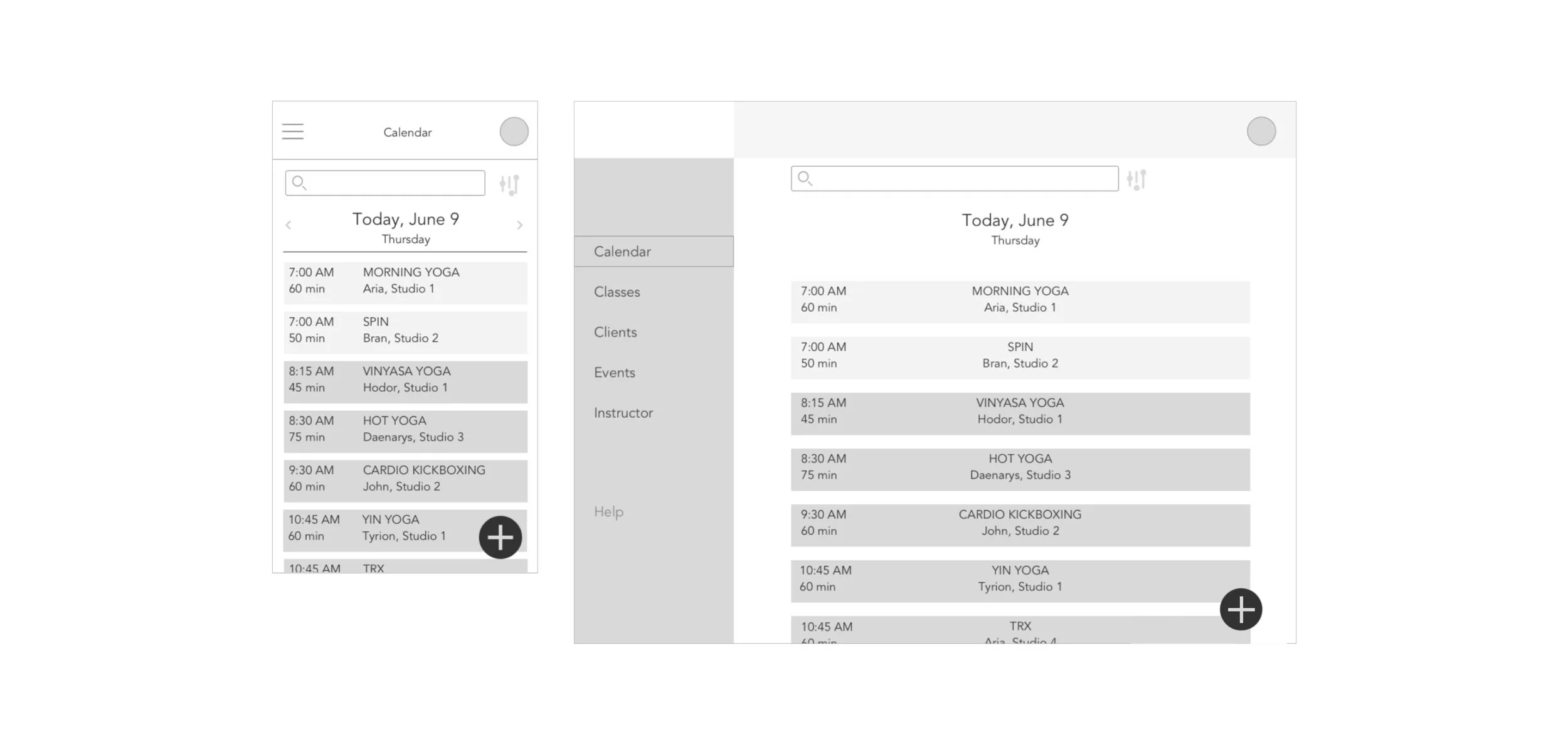
v2
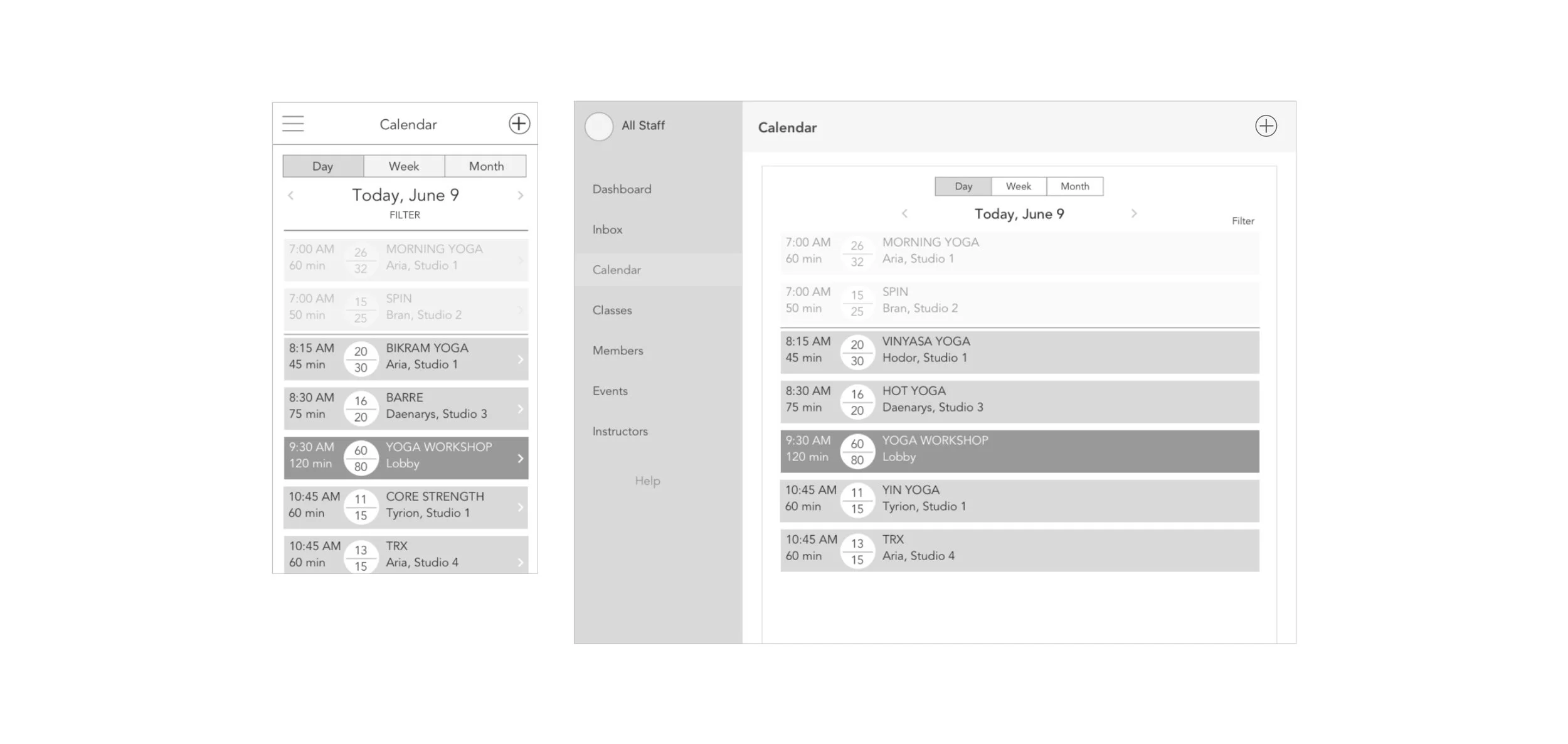
v3
v4
v5

v6
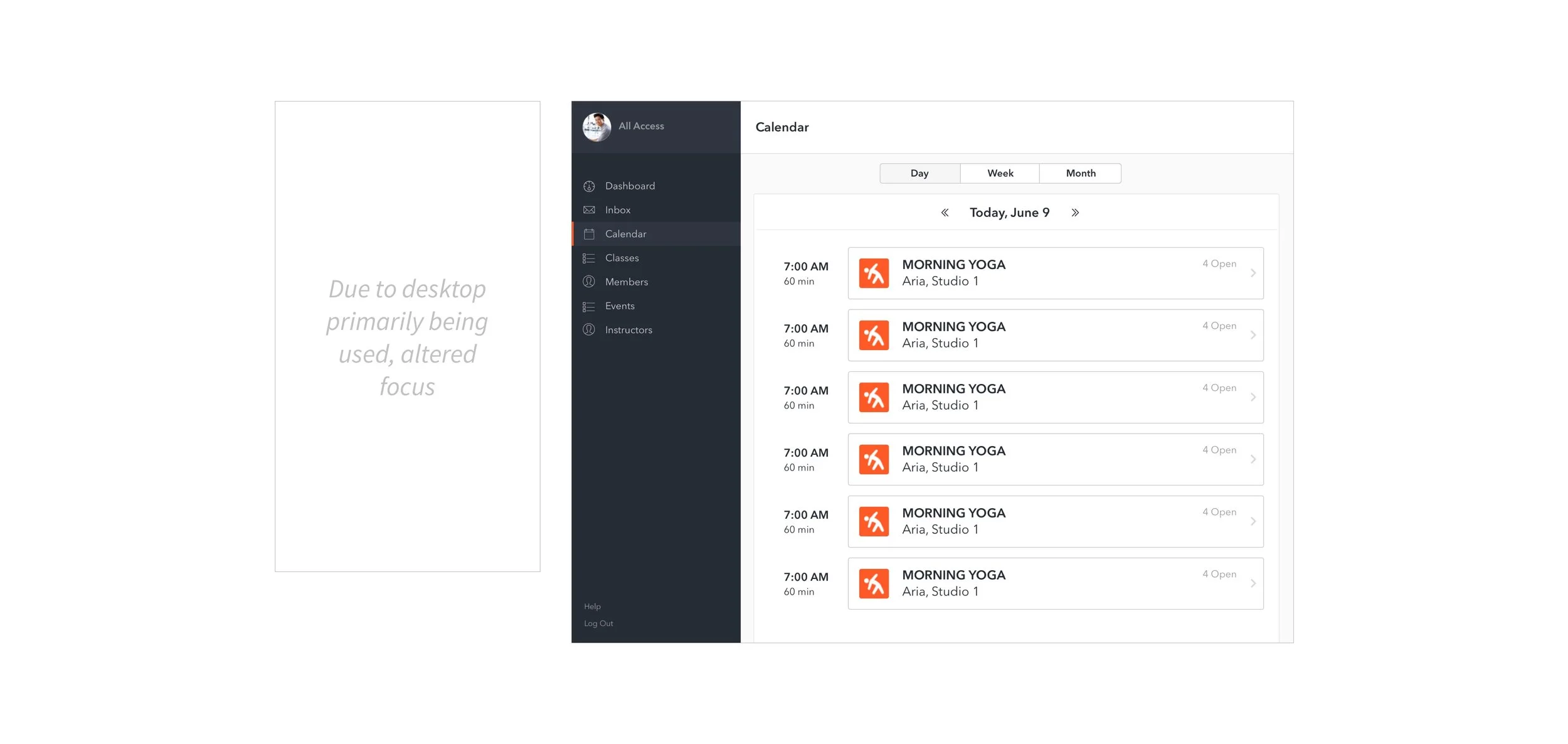
Working Style Guide
Using David Frost's design methodology, I led the development of the working style guide. Vint didn't have much of a working style guide to go off of so we largely used their former admin panel as a baseline for recreating many of the components to remain on brand. This guide helped us streamline the hi-fidelity process.

PHASE 04 | Validation
Prototype
I built and structured a testing guide with one other person for our prototype. Check out the quick gif below illustrating Vint's main features (calendar, class and member management) or feel free to browse more extensively through the Marvel prototype.

Usability Testing
In order to validate our designs, we chose to test the product on desktop with a mix of users, 4 of which worked were target industry users and 6 of which had little or no experience being employed by a gym or fitness studio. These were our high levels goals:
- Determine if users understand component and flow
- Identify areas that frustrate or confuse users
- Utilize findings to provide recommendations for further development and next steps
Highlighted Results

10/10 users able to locate a specific class and add a member to a specific class

8/10 users able to were able to create a new class with ease

10/10 users felt Vint was easy-to-use, found the aesthetic appealing and thought information was presented in a way that was easy to understand

2/10 users went to calendar first to add a new class

4/10 users thought the share button was a navigation button and that "Open Spots" was a clickable button
" Vint was pretty easy. The pictures make it seem easy. I’ve used Mindbody here and at Equinox, too. It’s [Mindbody] not as pretty looking. I like the prettiness [of Vint]. It makes me feel positive" – Yoga Instructor @ Orange Theory
Phase 05 | Synthesis
Recommendations + Next Steps
- UI Elements: remove button feel for "Open Spots" and alter "Share" button to reflect closer graphic meaning
- Integrate adding a class feature in calendar
- Develop and integrate instructor profiles
Based on early findings, focus on creating customization needed for various permission rights
Wrap Up
After the end of a project, I always like to ask myself what worked well and what didn't work well. Moreover, what can I do moving forward to improve. Below are a few of these "lessons learned":
Leading a large design team meant on one end there was a ton of potential for horsepower but on the other end, a lack of intimacy. In effect, this caused the connective tissue among user flows to have some holes. To combat these holes, I would encourage frequent micro team collaboration meetings early on.
Another item that came up at times in leading a large design team was dealing with a lack of visual consistency and cohesion. Standards need to be set up as early as possible to reduce for even us designers, cognitive load and extra work.